Comprehension
The plots below depict and compare the average monthly incomes (in Rs. ’000) of males and females in ten cities of India in the years 2005 and 2015. The ten cities, marked A-J in the records, are of different population sizes. For a fair comparison, to adjust for inflation, incomes for both the periods are scaled to 2025 prices. Each red dot represents the average monthly income of females in a particular city in a particular year, while each blue dot represents the average monthly income of males in a particular city in a particular year. The gender gap for a city, for a particular year, is defined as the absolute value of the average monthly income of males, minus the average monthly income of females, in that year.
Question: 1
In which city did the gender gap, in terms of 2025 prices, change the least, from 2005 to 2015,in terms of percentage?
In which city did the gender gap, in terms of 2025 prices, change the least, from 2005 to 2015,in terms of percentage?
Show Hint
In such problems, carefully analyze the movement of the dots for each city to find where the gender gap has changed the least or the most.
Updated On: Jan 13, 2026
- J
- E
- C
- D
- I
Show Solution
The Correct Option is
Solution and Explanation
Step 1: Define the gender gap.
The gender gap is the absolute difference between the average monthly incomes of males and females in a given city for the specified years (2005 and 2015).
Step 2: Evaluate gender gap progression.
The change in the gender gap between 2005 and 2015 for each city can be assessed by observing the relative positions of the red and blue markers for each year.
Step 3: Pinpoint the city with minimal gender gap alteration.
Through visual comparison of the gender gap variations across cities, it is determined that city I experienced the least change.
Final Answer: \[\boxed{\text{(E) I}}\]
Was this answer helpful?
0
Question: 2
Which of the following statements, about the average monthly incomes of the 10 cities, as represented in the plots, is DEFINITELY FALSE?
Which of the following statements, about the average monthly incomes of the 10 cities, as represented in the plots, is DEFINITELY FALSE?
Show Hint
When analyzing average monthly incomes, carefully check the data and scales used for comparison in different years and price adjustments.
Updated On: Jan 13, 2026
- In terms of 2025 prices, the average gender gap of the 10 cities combined in 2015 was less compared to the average gender gap of the 10 cities combined in 2005.
- In terms of 2025 prices, the average monthly income of men of the 10 cities combined was less than Rs. 30,000 in 2005.
- In terms of 2025 prices, in more than half of the 10 cities, average monthly incomes of men were more in 2005, compared to 2015.
- In terms of 2025 prices, the average monthly income of women of the 10 cities combined was less than Rs. 22,000 in 2015.
- In terms of 2025 prices, the median monthly income of men of the 10 cities combined were higher than the median monthly income of women of the 10 cities combined, both in 2005 and 2015.
Show Solution
The Correct Option is B
Solution and Explanation
Step 1: Analyze the given statements.
Each statement must be verified against the provided plots, which illustrate the monthly incomes of men and women across different cities on a monthly basis. Visual inspection of these graphs will enable statement validation.
Step 2: Identify the false statement.
Statement (B) is determined to be false. The data indicates that in 2005, the average monthly income for men exceeded Rs. 30,000, when adjusted to 2025 prices.
Final Answer: \[\boxed{\text{(B) In terms of 2025 prices, the average monthly income of men of the 10 cities combined was less than Rs. 30,000 in 2005.}}\]
Was this answer helpful?
0
Question: 3
Rs.100 in 2025 is worth Rs. 60 in 2015 prices, and Rs. 25 in 2005 prices. Based on the given plots, which of the following statements, about the unscaled incomes, i.e., the incomes before scaling to 2025 prices, CANNOT be correct? (All statements refer to people represented in the given plots.)
Rs.100 in 2025 is worth Rs. 60 in 2015 prices, and Rs. 25 in 2005 prices. Based on the given plots, which of the following statements, about the unscaled incomes, i.e., the incomes before scaling to 2025 prices, CANNOT be correct? (All statements refer to people represented in the given plots.)
Show Hint
When analyzing income data, be cautious of how scaling to 2025 prices impacts the interpretation, especially for gender gaps.
Updated On: Jan 13, 2026
- Average unscaled income of women was about Rs. 15,000 in 2015 in City G.
- Average unscaled income of women in City G increased by about 120% from 2005 to 2015.
- Average unscaled income of men in City E increased by about 140% from 2005 to 2015.
- The unscaled gender gaps reduced in all 10 cities from 2005 to 2015.
- Average unscaled income for both genders increased in all 10 cities from 2005 to 2015.
Show Solution
The Correct Option is D
Solution and Explanation
Step 1: Analyze unscaled incomes.
Examine unscaled income data presented in the plots, observing percentage changes between 2005 and 2015.
Step 2: Verify statement accuracy.
Statement (D) is inaccurate as the unscaled gender gaps did not decrease across all cities according to the provided data.
Final Answer: \[\boxed{\text{(D) The unscaled gender gaps reduced in all 10 cities from 2005 to 2015.}}\]
Was this answer helpful?
0
Top Questions on Data Interpretation
- The monthly salary for a person who follows the same expense pattern, but has a petrol expense of Rs 500 p.m., is:
- VITEEE - 2024
- General Aptitude
- Data Interpretation
- In a code language, 'TIGER' is written as 'JUISF'. How will 'EQUAL' be written in that language?
- VITEEE - 2025
- General Aptitude
- Data Interpretation
- Read the Passage carefully and answer the following questions.
An air conditioner (AC) unit has three operating modes: Eco, Normal, and Turbo. The power consumption in each mode is as follows: Eco mode consumes 1000 watts, Normal mode consumes 1200 watts, and Turbo mode consumes 1500 watts. Yesterday, the AC was in operation from 2 PM to 10 PM. From 2 PM to 6 PM it ran in Eco mode. From 6 PM to 8 PM, it ran in Normal mode. From 8 PM to 10 PM it ran in Turbo mode.- CAT - 2024
- Data Interpretation & Logical Reasoning (DILR)
- Data Interpretation
- Read the Passage carefully and answer the following questions
A health food store specializing in dietary supplements and whole grains recorded the following sales figures (in kilograms) for various food categories last month: Millets (M) = 500 kg at a cost price of 40/kg and selling price of 50/kg; Protein supplements (P) = 300 kg at a cost price of 80/kg and selling price of 100/kg; Vitamin supplements (V) = 200 kg at a cost price of 60/kg and selling price of 80/kg; Carbohydrates (C) = 600 kg at a cost price of 80/kg and selling price of 100/kg; Fats (F) = 100 kg at a cost price of 120/kg and selling price of 150/kg. Additionally, they sold 50 kg of mixed nuts (N) at a cost price of 100/kg and a selling price of 130/kg- CAT - 2024
- Data Interpretation & Logical Reasoning (DILR)
- Data Interpretation
- Want to practice more? Try solving extra ecology questions todayView All Questions
Questions Asked in XAT exam
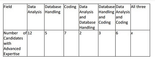
Applicants have been shortlisted for interviews for some data analyst positions. Some of the applicants have advanced expertise in one or more fields among the following: data analysis, database handling and coding. The numbers of applicants with different advanced expertise are given in the 2 × 8 table below.
The number of applicants with advanced expertise in all three fields is given as x in the table, where x is a non-negative integer.
The number of applicants with advanced expertise in all three fields is given as x in the table, where x is a non-negative integer.
- XAT - 2024
- Data Interpretation